My First Stickers
11 July 2026
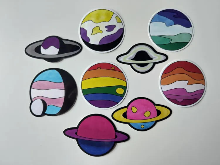
I recently started to teach myself drawing, and wanted to make some sticker for QueerCon, a local LGBTQIA+ game/geek con on the days before the pride parade. With the theme of my website and my background in astrophysics, planets and other astronomical objects seemed like a great option (and also less daunting than other objects).
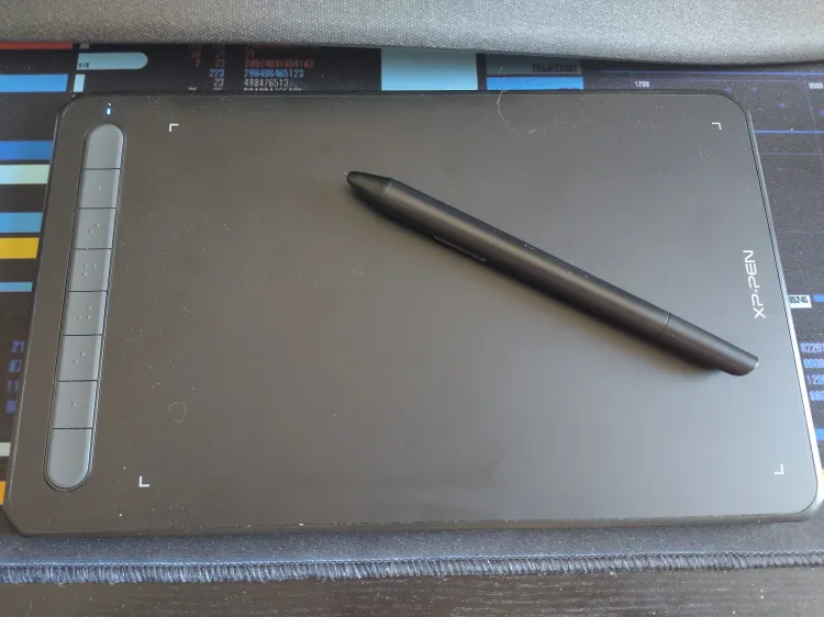
For those thinking about how to get started, I figured I'd write up a quick post about my process. Let's start with the tools: I started with some pencil-and-paper concept drawings (using a compass for the circular outline) and then used a drawing tablet (an XP-Pen Deco MW, not sponsored or affiliated) to trace photos digitally in Krita. For some of the basic shapes, circles and ellipses I used Inkscape, because it has better tools for splitting and merging vector paths.
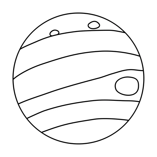
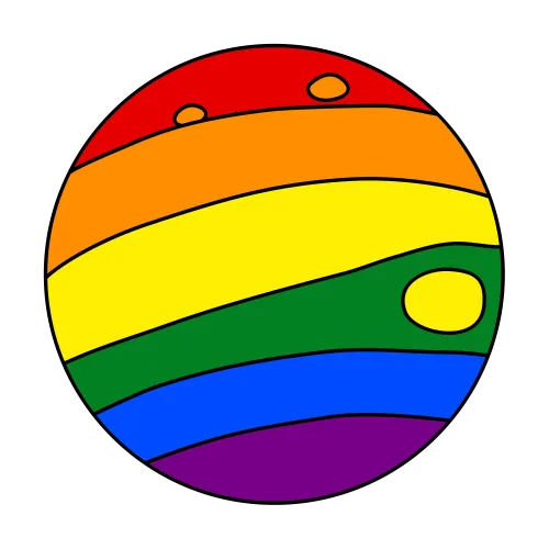
The vector outline of the rainbow planet (inspired by Jupiter) started with a circle, two with I added line to separate the stripes by hand and then smoothed them out with the path editing tool. (I kept the background transparent, but added a white background for better visibility here.)
Then I selected each area with the magic wand selector, configured to add 5 pixels on the outside. Those extra pixels were important, so the outline got filled completely. Then I used a simple pen brush to fill each area with the base color on a layer below the vector lines.
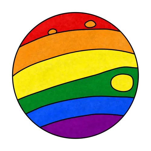
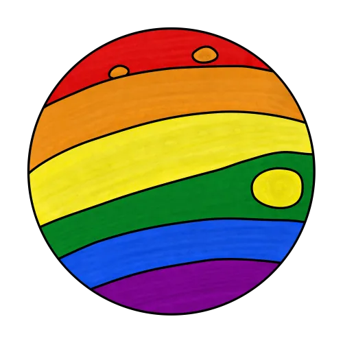
Lastly, I felt like it need some extra texture. I used to different texture brushes in shades darker and lighter than the background. As a first pass, I used the crackles texture for a cloud-like look, and then the wood fiber texture brush with a large brush size for a sense of directionality on the stripes, plus a few swirls here and there.